



Harvard University Press printer's mark

View diverse versions of HUP's logotype through time.

1924

1924 | Courtesy of Harvard University Press

1925 and 1940

1925 and 1940 | Courtesy of Harvard University Press

1931

1931 | Courtesy of Harvard University Press

1931 and 1932

1931 and 1932 | Courtesy of Harvard University Press

1935

1935 | Courtesy of Harvard University Press

1936

1936 | Courtesy of Harvard University Press

1938

1938 | Courtesy of Harvard University Press

1949

1949 | Courtesy of Harvard University Press

1950

1950 | Courtesy of Harvard University Press

1960

1960 | Courtesy of Harvard University Press

New logo

New logo | Courtesy of Harvard University Press

New logo on book spine

New logo on book spine | Courtesy of Harvard University Press and Chermayeff & Geismar

Shielded Identity

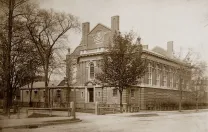
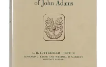
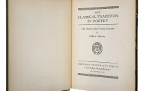
For a hundred years, Harvard University Press appears to have had no logo it could call its own. When a designer fashioned a title page for a book, or stamping for its spine, or a catalog of forthcoming books, or a flyer promoting them, he or she appears to have turned to the type-specimen book of the Printing Office (the office itself closed in 2002) and used one of scores of Harvard shields found there. Sometimes indecision seized the designer, and one shield appeared on the spine and a different one on the title page. Shown here is a small sampling of the shields that have adorned Press publications. Sometime in the mid 1970s, the use of shields became infrequent, and a simple "Harvard" appeared on book spines, in this typeface or that. 

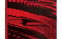
To help mark its centennial, the Press has adopted a new, cohesive visual identity. The logo takes the form of two vertical rows of three crimson rectangles, with the letter H visible in the negative space between the six rectangles. Sagi Haviv, partner at the design firm Chermayeff & Geismar, which worked with the Press to create the new look, said that it will be well suited for a variety of uses: "The new identity is simple enough that it will be effective both in traditional applications, such as book spines and title pages, and also in digital media such as app icons, browser icons, and e-books."

You might also like

Boston Ballet’s Ming Min Hui on Changing Audiences and Timothée Chalamet

The outgoing executive director and Harvard Business School graduate went from dancing The Nutcracker to growing a ballet company.

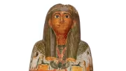
Padimut at Harvard

A rare Egyptian mummy case is on display at the Harvard Museum of the Ancient Near East.

Resculpting an Empire, Through Kitchen Scraps

Artists Enzo Camacho and Ami Lien turn a colonial symbol from Cambodia inside out.

Most popular

Lafayette’s Unexpected Gift to George Washington: Pheasants

The two birds will be on display at Harvard this summer.

Harvard Weathers a Year of Turmoil

The federal government has launched unprecedented actions against the University. Here’s a guide.

Who Is Accountable for the Acts of AI Systems?

Establishing legal responsibility for autonomous agents

Explore More From Current Issue

A man with a long beard and formal attire stands next to a chalkboard with an equation.

Two tales of University greats—and an encounter with a Tiger

Collage of three photos of an athlete in a triathlon: one swimming, one cycling, one running, in sports attire.

The Harvard triathlete and coach says she helps normal people to “do extraordinary things.”

Colorful illustration of a split-level house showing various activities in different rooms.

Can the College do more to prepare students for the real world?