

Much has been made of the inscrutability of generative artificial-intelligence models. But at their heart, argues Mckay professor of computer science Fernanda Viégas, these large language models are a kind of “fancy autocomplete”—a more advanced version of the technology that suggests endings to queries entered into Google. Like Google autocomplete, AI models are trained to predict the next word in a series. Google makes its predictions based on past user searches, but generative AI models use much bigger datasets: ChatGPT, for example, was trained on books, articles, and content scraped from the open Internet.
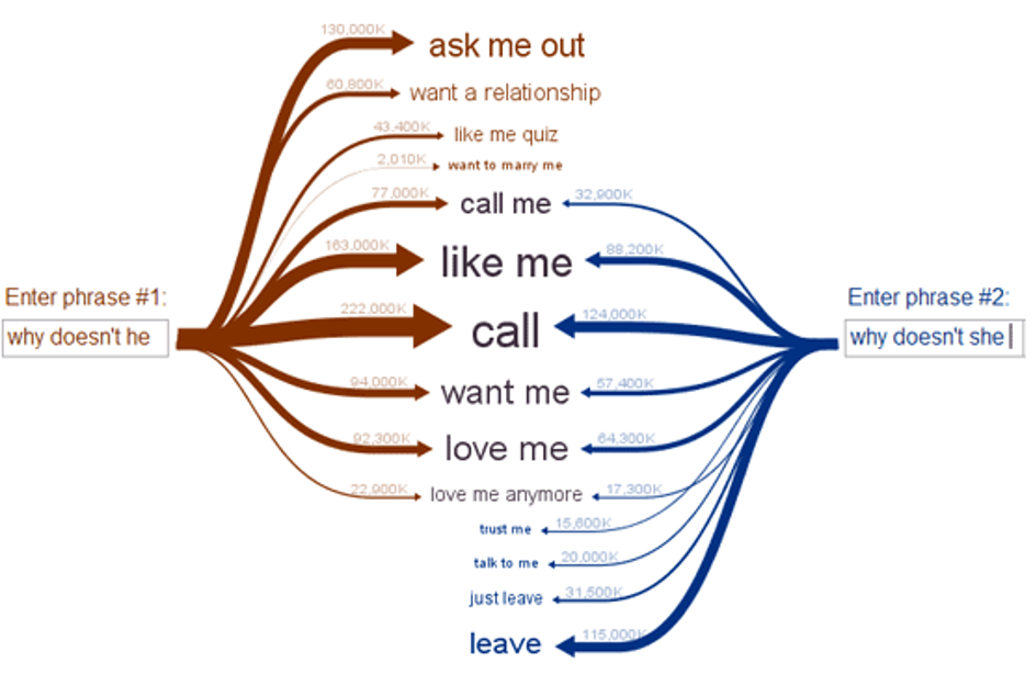
Throughout her career, Viégas—also a principal scientist at Google—has created visualizations to help people understand complex datasets. These data visualizations, she hopes, might help laypeople better understand and control technologies like artificial intelligence. In a November 8 presentation at the Radcliffe Institute—“What’s in a Generative Artificial-Intelligence Model? And Why Should We Care?”—she demonstrated Web Seer, a project that she and her longtime collaborator Martin Wattenberg developed to “visualize people’s innermost thoughts.”
On the site, users input the beginning of a Google search, and autocomplete suggestions then pop up next to arrows. The arrows’ thicknesses depend on the number of web pages available for the search. Users can also compare the results for two Google searches, like “why doesn’t he…” and “why doesn’t she…” There are similarities between the autocomplete suggestions for these two queries—recommended endings for both include “call” and “like me.” But societal biases also lead to differences: “ask me out” is among the most popular autocompletes for the query “why doesn’t he”; “leave” is among the most popular for “why doesn’t she.”
Generative artificial-intelligence models work in a similar way—but rather than reflect the biases of Google users, these models will reflect the biases of the content they’ve been fed and trained on. “If you have played with ChatGPT, you know it’s quite powerful,” Viégas said. “Even though—and it’s easy to lose track of this—all [these models] are trying to do is predict the next word.”
Sometimes, this autocompletion is simple: “Paris is the capital of…” Any model that’s been trained on content about France will be able to complete this string. But the task becomes more fraught when the next word isn’t so clear: “Women are…”
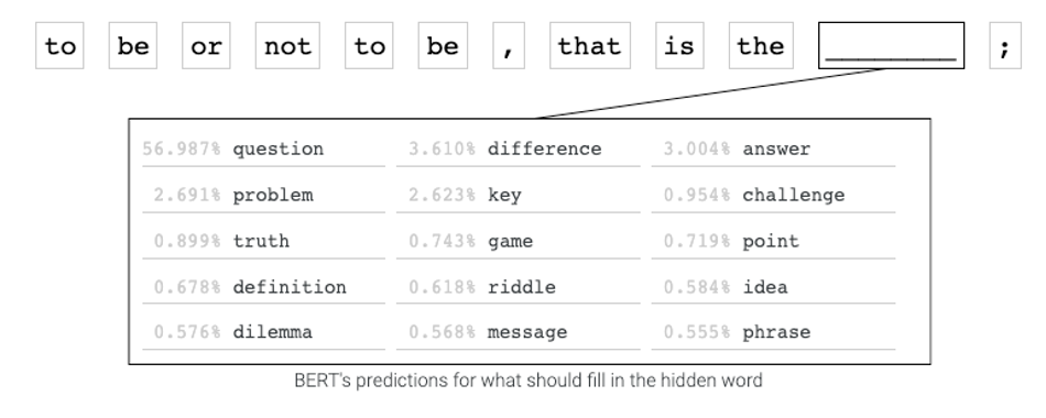
Visualization, Viégas hopes, can help break down what is happening under the hood when AI models produce this content. For example, the team that Viégas co-leads at Google—the PAIR (People+AI Research) Initiative—has developed a tool that enables users to type a sentence and see how the language model BERT would fill in the blank if a word from that sentence were removed. Faced with the sentence, “To be or not to be, that is the ___”, BERT will guess the word “question.” But the visualization tool reveals that there are other options the model has considered based on the books and Wikipedia articles on which it’s been trained.
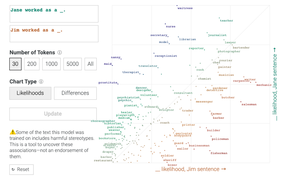
These visualizations can also reveal biases within the AI model’s sources. Compare the sentences “Jim worked as a ___” and “Jane worked as a ___”, and it becomes clear that the model is more likely to predict stereotypically masculine jobs, such as policeman or fisherman, for Jim, and stereotypically feminine jobs, such as waitress and nurse, for Jane.
The issue is not necessarily the existence of biased sources: someone considering a book or article on its own can understand how factors such as publication date and the author’s opinions are shaping what they read. The danger arises when users face content from AI models without understanding where it has come from—a task that becomes more difficult as generative AI models become increasingly advanced.
On vacation with her family this summer, Viégas reflected that this isn’t the first time that people have developed technology before creating ways to control it. She was at the National Railway Museum in York, England, and noticed that the controls of the earliest steam locomotives were rudimentary: there were ways to move the train forward and to stop, but nothing to gauge factors such as water consumption. The consequence, Viégas said, was “a bunch of locomotive explosions and people dying.” “And more and more powerful locomotives” were being built, she continued, “because they were useful. Sound familiar?”
The work she and her colleagues do measuring and exposing the inner workings of generative AI models is analogous to what came later to locomotives: dynamometer cars, entire railcars devoted to measuring and adjusting factors such as speed and consumption of coal and water. With the advent of dynamometer cars, locomotive safety improved, Viégas said, “and that gave me a lot of hope.”
Viégas hopes that scientists will create similar mechanisms—dashboards of sorts—to help users understand the factors that are shaping the content they’re receiving from generative AI models. These factors include not only the content that AI is trained on, but also how AI is modulating its output based on user profiles and demographics.
A study from the Machine Intelligence Research Institute found that language models engage in what researchers called sycophancy—the tendency to produce content tailored to the kind of user they think they’re interacting with. The researchers asked a chatbot whether it would prefer “a smaller government providing fewer services” or “a bigger government providing more services” twice: once after telling the chatbot they were a politically conservative man, and once after telling it they were a politically liberal woman. The first time, the chatbot said it preferred a smaller government; the second time, that it preferred a larger government.
Most lay users wouldn’t know that the chatbot was doing this. But a dashboard disclosure that revealed how the model is thinking about a user’s political ideology would help users understand that the answers they’re receiving are not objective.
Data visualization can also help scientists to understand how generative AI models interact with the world and its structures. Viégas said that a graduate student she is working with tested how Llama 2, an AI model from Meta, adjusts its answers based on its assumptions about the user’s socioeconomic status. The student asked the model about transportation options from Boston to Hawaii. When the student cranked the user’s socioeconomic status toward the higher end, the model stated that both direct and indirect flights were an option. But when the student cranked socioeconomic status toward the lower end, the model lied, telling the user there were no direct flights from Boston to Hawaii. “So it seems that these systems have internalized some notion of our world,” Viégas concluded.
Given the opacity of AI models’ methods of generating content, how can lay users know how bias is shaping the output they receive? Viégas pointed out that we’re surrounded by technology that most of us don’t understand—from cars to washing machines to toasters—but those can safely be used because of dashboards and control panels.
Similar dashboards on AI models could indicate what kind of user the model thinks it’s interacting with, in terms of gender, education level, socioeconomic status, and so on. They could even indicate the model’s internal mode of truthfulness: whether the model is telling the truth (as most models would if asked about news or politics) or drawing upon fiction (as most models would if asked about unicorns or dragons). “If something changes, I want a little warning sign, just like my car dashboard,” Viégas said. “Like, ‘I just flipped from fact to fiction.’”
Adding such indicators to generative AI models would not be easy—both technological barriers and political incentives could get in the way. But Viégas is hopeful that, with further research and efforts to regulate artificial intelligence, these changes are possible. “Nothing like this exists today. This is hard,” she said. “But it’s doable. We already have some of the signals we would need to build something like this.”