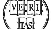
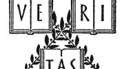
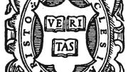
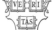
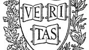
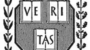
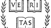
Harvard University Press printer's mark

View diverse versions of HUP's logotype through time.

1924
1925 and 1940
1931
1931 and 1932
1935
1936
1938
1949
1950
1960
New logo
New logo on book spine

Shielded Identity

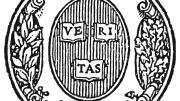
For a hundred years, Harvard University Press appears to have had no logo it could call its own. When a designer fashioned a title page for a book, or stamping for its spine, or a catalog of forthcoming books, or a flyer promoting them, he or she appears to have turned to the type-specimen book of the Printing Office (the office itself closed in 2002) and used one of scores of Harvard shields found there. Sometimes indecision seized the designer, and one shield appeared on the spine and a different one on the title page. Shown here is a small sampling of the shields that have adorned Press publications. Sometime in the mid 1970s, the use of shields became infrequent, and a simple "Harvard" appeared on book spines, in this typeface or that. 

To help mark its centennial, the Press has adopted a new, cohesive visual identity. The logo takes the form of two vertical rows of three crimson rectangles, with the letter H visible in the negative space between the six rectangles. Sagi Haviv, partner at the design firm Chermayeff & Geismar, which worked with the Press to create the new look, said that it will be well suited for a variety of uses: "The new identity is simple enough that it will be effective both in traditional applications, such as book spines and title pages, and also in digital media such as app icons, browser icons, and e-books."

You might also like

Novelist Lev Grossman on Why Fantasy Isn’t About Escapism

The Magicians author discusses his influences, from Harvard to King Arthur to Tolkien.

This TikTok Artist Combines Monsters and Mental Heath

Ava Jinying Salzman’s artwork helps people process difficult feelings.

England’s First Sports Megastar

A collection of illustrations capture a boxer’s triumphant moment. 

Most popular

Why Men Are Falling Behind in Education, Employment, and Health

Can new approaches to education address a growing gender gap?

Harvard art historian Jennifer Roberts teaches the value of immersive attention

Teaching students the value of deceleration and immersive attention

Mark Carney on the Limits of Soft Power

At the 2026 Davos summit, the Canadian prime minister echoes Harvard’s Joseph Nye.

Explore More From Current Issue

Two bare-knuckle boxers fight in a ring, surrounded by onlookers in 19th-century attire.

England’s First Sports Megastar

A collection of illustrations capture a boxer’s triumphant moment. 

An axolotl with a pale body and pink frilly gills, looking directly at the viewer.

Regenerative Biology’s Baby Steps

What axolotl salamanders could teach us about limb regrowth

Cover of "Harvard's Best" featuring a woman in a red and black gown holding a sword.

A Forgotten Harvard Anthem

Published the year the Titanic sank, “Harvard’s Best” is a quizzical ode to the University.